Dealing With Overlap
We’re now working on dealing with the last major component of the Planet Four data processing pipeline, the overlap regions of neighboring subject images. We divide each HiRISE images into many smaller 840×648 pixel subimages or subjects that we show on Planet Four. To make sure we capture fans and blotches that are the edges of our subject images, we have a 100 pixel overlap between the neighboring left and bottom subject images. This means that we have duplicate markings that cover the same source which we need to identify as being the same source to allow for counting the number of seasonal sources and to also accurately measure the shape of very large fans or blotches.
We spent part of the last science call looking at some examples of overlap regions and the outputting fan and blotch shapes after clustering to decide what to do.

Image credit: K-M. Aye

If you focus on the center sources in the two plots above, you see there are lots of markings identifying the same shape from the different subject images that contained varying parts of the central blotch or fan. Based on what we see, we think we if in the overlap region we only keep the largest source and anything that extends beyond that we will accurate identify the fan or blotch being marked. We’re going to test that this week and review the output from the catalog for a small portion of the overlap regions to confirm.
Once we sort what to do in the overlap regions, the focus should be writing all of the steps in the processing pipeline into the paper draft.
Planet Four: Terrain’s First Science Paper Accepted for Publication
I’m pleased to announce that our first scientific paper for Planet Four: Terrains was accepted to the journal Icarus. Below is a snapshot from the top of the paper manuscript, and the paper is publicly available via the free preprint we’ve put online here.

A big thank you to all the volunteers who contributed to the publication. We acknowledge everyone who contributed to the project on the results page of the Planet Four at: http://p4tauthors.planetfour.org
The paper presents the first spider and swiss cheese terrain catalog derived from your classifications. 90 CTX images comprising ~11% of the Martian South Polar region southward of -75 N latitude were searched by Planet Four: Terrains volunteers. This comprised approximately 20,000 subject images reviewed on the Planet Four: Terrains website with 20 independent reviews. The P4: Terrains search coverage is shown below:

Footprint of CTX image searched by Planet Four: Terrains for the first paper
Applying a weighting scheme, we combine classifications together to identify spiders and swiss cheese terrain. The weighting scheme isn’t testing anyone, but it helps us find more spiders by allowing us to pay slightly more attention to those that are better at identifying spiders and help increase the overall detection efficiency of the project. Details can be found in the paper.
Using the weighting scheme each Planet Four: Terrains subject has a spider score which is the sum of the weights of the volunteers who identified spiders in the image divided by the sum of the weights of the volunteers who reviewed the subject image. Using classifications from Anya and I for a very small subset of the subject images, we found a spider scores above which we’re highly confident the identifications have few false positives.
To our surprise when we compared to the map of the secure spider locations to the geologic map of the South Polar region, we found araneiforms or spiders where we didn’t expect them to be. In previous surveys of the South Polar region, araneiforms were found to be located only on the South Polar Layered deposits (SPLD). The SPLD has been measured to have a height of ~4 km and covering a surface area of ~90,000 square kilometers mainly comprised of varying dust and water ice layers as well as some buried carbon dioxide and water ice deposits. Previous works have theorized that something about the unconglomerated nature of the SPLD, might make it easier for spiders to form there than other areas of the South Polar region

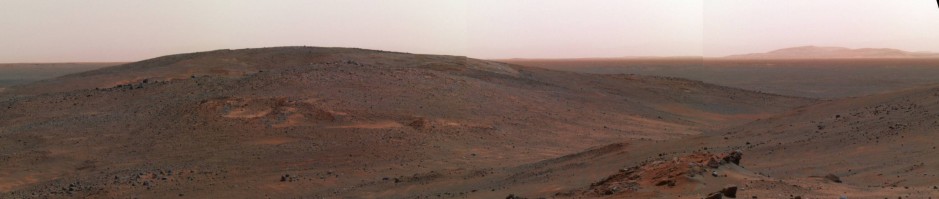
CTX side view of the SPLD

Magenta points show the Planet Four: Terrains spider identifications on top of the geologic map. The dark blue represents the South Polar Layered Deposits (SPLD).
To confirm these identifications were real, we needed HiRISE imaging. CTX has a resolution of 6-8 m/pixel. HiRISE can resolve up to a coffee table on Mars with a resolving power of 30 cm/pixel. With HiRISE we could see the wiggly dendritic nature of the channels and as well see seasonal fans to confirm that these form via the carbon dioxide jet process. 8 areas outside of the SPLD were targeted last Summer and Fall by HiRISE.
Below are just a few examples of the HiRISE subframes of these regions off the SPLD:

Image credit: NASA/JPL/University of Arizona

Image credit: NASA/JPL/University of Arizona – Schwamb et al. (in press)

Image credit: NASA/JPL/University of Arizona – Schwamb et al. (in press)

Image credit: NASA/JPL/University of Arizona – Schwamb et al. (in press)

Image credit: NASA/JPL/University of Arizona – Schwamb et al. (in press)
There be spiders! Araneiform channels can clearly be seen in the images above. The HiRiSE images confirm the spider/araneiform identification. We also see seasonal fan activity as well. For the first time we have found spiders/araneiforms outside of the SPLD!
This result is exciting. For some of these areas we have sequences with HiRISE taken over time which we hope we can put it into Planet Four to measure how the fans sizes and appearance are different from their counterparts on the SPLD. Now we get a chance to study how these locales off the SPLD are similar or differ from the SPLD and try to learn why these areas and not others have spider channels.
We’ve only searched a small fraction of the Martian South Polar region. We have more images on the site to expand the search area to see where else spiders/araneiforms may be. Help us today by classifying an image or two at http://terrains.planetfour.org
Ziggy Stardust and the Spiders from Mars: Part III –Answers to Questions for the Science Team
Planet Four volunteer Peter Jalowiczor got asked a great set of questions after his public talk to his local Astronomical society. Below you’ll find the replies from Anya:
What evidence is there for cracking (of the ice) in the Martian surface?
We have actually observed the cracks in the seasonal ice layer appearing and evolving. We have seen them in multiple locations and several years. There is a paper on this:
Portyankina, G., Pommerol, A., Aye, K.-M., Hansen, C. J., & Thomas, N. (2012). Polygonal cracks in the seasonal semi‐translucent CO2 ice layer in Martian polar areas. Journal of Geophysical Research: Planets, 117(E2), DOI: http://doi.org/10.1029/2011JE003917. It has examples of observed cracks in spring from southern and northern hemispheres.
Was there certainty that the channels were not ridges? (Yes, this is an optical illusion!)
Yes, there is certainty. We know the direction of sun illumination on every image that HiRISE (or any other camera) takes. We can compare it to the locations of shadowed and illuminated sides of the channels. We have done it multiple times and it always fits to the assumption that those are channels not ridges.
Where does the blue colour come from?
This question has 2 parts:
1) Camera technology: the blue color is detected by the CCD that has a filter in front of it and thus only sensitive to blue part of visible spectra. In HiRISE we call it blue-green channel and highest sensitivity centered at 536 nm.
2) Light scattering by different materials: when light hits the surface of Mars, it is scattered differently by different material. Martian “soil” most efficiently scatters red light and makes Mars look brown-red. Fresh frost scatters rather efficiently most of sunlight spectral range, but particularly well in the blue part. This is true for both, CO2 or water frost. Thus, the blue patches in HiRISE images in polar regions are where CO2 or water ice lies at the top of the martian soil.
Is the North Polar region of Mars going to be investigated in the same way as the South polar region?
We would like to do that, given we get support and funding.
What height are the geysers?
We have not observed them in action, which means only theoretical estimates exist. For a jet that is constantly outgassing early in spring from underneath 1-m thick ice layer with a vent that is <1m2, the maximum estimated height is 70 m. If the pressure under the ice first builds up and then releases in eruption-style event, the height estimate is several times higher but highly uncertain.
Is there an imaging dataset, perhaps an experiment on a satellite, which could enable these heights to be measured more accurately?
Not currently. We are proposing for a small mission to be able to do just that.
How often do we return to each of the imaged areas? Surely there must be some follow-up to see how the features have developed.
We image every location several times per spring. Our main locations (Inca City, Ithaca, Giza, etc.) get up to 10 images per season. We also image them every summer when they are free of ice. Repeated imaging in summer is targeted to detect the changes in the araneiform structures, but it is very tricky goal, as the atmospheric and illumination conditions should be very similar in order to definitely detect any topography changes. Right now we have 5 martian years of observations but no certain detected topography changes.
Dealing with Overlap
Now that we have frozen development of the clustering algorithms for both blotches and fans and reviewed the stage of combining the different types of clusters together, we are working on the next issue. This is dealing with markings from the overlap regions of Planet Four subject images. For most Planet Four subject images, there is 100 pixel overlap with a neighboring subject image. So in our current catalog we have duplicates possibly of seasonal fans and blotches that appeared in more than one Planet Four subject image.
We’ve started to look into what’s the best wave to deal with this. The main reason we have the overlapping regions between adjacent Planet Four subject images is to make sure we identify seasonal fans that would get cut off between the two subject images if there was no overlap. The overlap should ensure at least one of the subject images has full view of the source, so we don’t miss anything.
Here’s an example of four adjacent subject images combined and the clustered markings drawn on.

Combination of four Planet Four subject images which overlap and the resulting catalog markings based on Planet Four volunteer classifications. Image Credit: Michael Aye
You can see that in the current catalog we get two overlapping blotches with slightly different orientations and centers generated from combining the volunteer classifications. If you look at what is in our catalog for each subject image that makes up the ensemble, you see that for one of the subject images the blotch is only partially on the image. The resulting blotch marker from the combined classifications is also partially on the image, it extends beyond. We might be able to use this fact that people extended the drawing markings to fit the shape if the source went over the edge, to identify those seasonal fans and sources that extend beyond the extend of the subject image and when that happens use the catalog entry from the overlapping subject images where the source was fully in the subject image. We’re testing this hypothesis by performing a manual review in the next week or so of the catalog output of a sample of overlap regions.

The right hand size blotch and resulting combined user drawn marking is partially on the subject image. Image credit- Michael Aye

subject image and associated blotch from the combined volunteer markings where the blotch is more visible Image credit- Michael Aye
A little bit fan and a little bit blotch
We’ve been reviewing the output coming from the full Planet Four data reduction pipeline now that we’ve frozen development on the fan and blotch clustering codes. Once we have the fan markings and blotch markings clustered individually, we then have a stage that combines the individual clusters to decide it a source marked by Planet Four volunteers is really a blotch or fan by find clusters where there centers on top of each other and then depending on how many fan markings went into the fan cluster and how many markings went into the blotch cluster we decide it’s a fan or a blotch for the final catalog. What we found in the catalog review that there are nice cases where there are sources that aren’t quite a fan only or not just a blotch. With a citizen science approach we’re able to capture that fuzziness which is fantastic. We highlight a few examples below selected by Michael Aye, who has been hard at work developing this pipeline over the past several years.
In all three figures: the top left is the Planet Four subject image, top middle is all the individual volunteer fan markings, top right is all the individual volunteer blotch markings, the bottom right is the blotch clusters after clustering, the middle bottom is the fan clusters after clustering, and the bottom left is the final sources after combining the fans and blotches (the dots in this panel show the center position of the final fan or blotch in our catalog).

Image credit: Michael Aye

Image credit: Michael Aye

Image credit: Michael Aye
As you can see from above, we’re making great progress on the Planet Four data reduction pipeline. Next steps including handing the fact that the edges of most of our Planet Four subject images overlap with neighboring subject images, and ensuring that we merge overlapping volunteer markings covering the same spot on two different subject images.
Towards Finalizing the Planet Four Clustering Algorithm
The science team is making great progress towards freezing developing of the Planet Four clustering algorithm. I reviewed some of the output from the pipeline Michael Aye has been writing. Basically the task was to check on the few issues we were working on addressing by having a two size regime clustering for blotches drawn by volunteeers and pick the parameters that seemed to work best for the data.The good news is we see an improvement.
I thought I’d share some of then plots so you so you can see how close we are to finalizing the pipeline. These plots are at the stage of clustering all the blotch markings alone and then clustering all the fan markings alone. We combine the fans and blotch markings into one later on in the process. For now we’ve just run the first part of the clustering pipeline and outputted the results to these figures. As you can see we’re doing pretty well at picking up all the fans and blotches marked by the majority of the classifiers who made a marking on the subject image.
We’ve got one or two more tweaks we brainstormed in the last science team call last week, and once we review those I think we’ll be freezing development on this part of the Planet Four analysis pipeline until after the first paper is submitted.


Progress on the Planet Four blotch clustering
We wanted to give a quick update on the original Planet Four. Michael Aye has been leading the development of the data analysis pipeline. As previously mentioned, we’ve hit a major milestone with completing the fan clustering algorithm for combining your classifications together. We think we’ve now hit that point for finalizing the blotch clustering algorithm.
We think we’ve now got a decent solution for addressing how to cluster very large blotches that take up half the image and very small blotches that are the default blotch circle size. Currently how we’re tackling this is clustering with one linking radius for the center of the blotch markings, and then we run the analysis again using a much larger linking radius. Here’s an example output:

Image credit: Michael Aye
This blotch clustering strategy seems to be a good compromise for our science goals and needs. We’re going to review several more test cases and if all goes well with this step, we will freeze development on the clustering pipeline. That’s one of the last hurdles to applying the pipeline to all of your classifications and dive into what the shapes and sizes and directions of the fans and blotches tell us about the seasonal carbon dioxide jet process and the surface winds in the Martian South Polar region.
Planet Four Progress
We wanted to give a quick update on Planet Four. Our main focus has been to get a data reduction pipeline that robustly clusters all the volunteer drawn markings of each subject image together to identify the seasonal fans and blotches and based on the majority shape select decide if the feature is a fan or a blotch. Michael Aye has been leading this effort. We’re pleased to say that that the main fan identification portion of the analysis pipeline is complete. We still have a few more things Michael has been working on for the blotch identification part. We think we’ve come up with a decent solution for identifying small and very large blotches. We hope to have this part of the analysis pipeline finalized soon. Then we will be able to apply the pipeline to all of your classifications and dive into what the shapes and sizes and directions of the fans and blotches tell us about the seasonal carbon dioxide jet process and the surface winds in the Martian South Polar region.

Normalized distribution of fan lengths based on volunteer markings from a specific HiRISE image – Image credit: Michael Aye and Anya Portyankina
New tiny spiders develop on Mars NOW!
Hi everybody!
I would like to share with you our new paper that just got published in January volume of Icarus journal.
The most exciting part of this paper is that HiRISE detected some new troughs in Martian polar areas. The troughs were not visible when the HiRISE observed those locations for the first time in Martian Years (MY) 28 and 29. But when we have commanded HiRISE to take repeated observations in MY 30 and 32, we were rewarded with images of new features that you can see in the animated image below.

Image Credit: NASA/JPL/University of Arizona
The troughs are really small: the whole image is less than 200 m across, while the new troughs are only up to 1 m wide. The total length of them reaches 582 m thanks to their multiple branches.
The new troughs, large enough for HiRISE to detect, are created under the current climate condition – and this is really a big deal. They do look much like spiders: they have different tributaries and resemble the dendritic nature of the large spiders. And they are developing. In turn this means that the large spiders might be developing right now as well. We are still waiting to see topographical changes on the large and fully developed spiders, but we know now that the process is able to erode away quite some ground material. For example, the volume of the material that was moved to create the troughs in the image above is 24 m², they were created over 3 MY, meaning, the process moved 8 m² yearly only in this one example.
The erosion rates like this lets us evaluate the age of the large spiders. They take amazing 1.3 thousands Martian years! It is a long time for a human being, but it is really just a blink of an eye for a geological feature.
We are continuing to monitor these locations to check if these troughs will not be erased in the next years. It well may happen because the new spiders are located very close to the dune fields, and moving sand is capable to cover or sand-blast these small topographical features barely in a year.
The official copy of the paper can be found here and JPL press-release about it is here. You may also read the article from Universe Today about this paper here.
Anya
Footprints of the HiRISE observations
I’ve been learning to use JMARS (Java Mission-planning and Analysis for Remote Sensing) to plot the coverage of the CTX images for Planet Four: Terrains. JMARS is a really nice tool for overlaying observation footprints and different maps and datasets on top of each other for Mars and other planets.
I decided to take a look at what the HiRISE Season 2 and Season 3 observations, that the science team is currently working on writing up, look like on a map of the South Pole when you plot their physical coverage on the pole . You can really see the overlap and what a small area that HiRISE covers compared to CTX.
Here’s the footprint HiRISE observations for Seasons 2 and 3 outlined in red on the elevation and topography map of the Martian south pole (latitude and longitude lines are in 10 degree intervals).

Here’s a zoom in on one of our favorite regions, Inca City. You can really see the repeat coverage outlined in white in this case.

Here’s another zoom in of a different area, where you can see multiple seasonal targets outlined in red:

For comparison here’s the footprints of the first set CTX images (latitude and longitude lines are in 10 degree intervals). The colors represent geologic units, but for this comparison we’re focusing on spatial distribution and coverage.

