Clustering the PlanetFour results
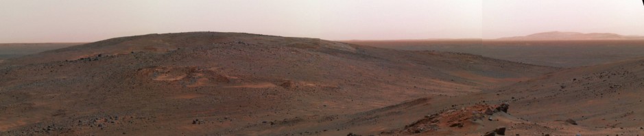
Our beloved PlanetFour citizen scientists have created a wealth of data that we are currently digging through. Each PlanetFour image tile is currently being retired after 30 randomly selected citizens pressed the ‘Submit’ button on it. Now, we obviously have to create software to analyze the millions of responses we have collected from the citizen scientists, and sometimes objects in the image are close to each other, just like in the lower right corner of Figure 1.

Figure 1: Original HiRISE cutout tile that is being shown to 30 random PlanetFour citizen scientists.
And, naturally, everybody’s response to what can be seen in this HiRISE image is slightly different, but fret not: this is what we want! Because the “wisdom of the crowd effect” entails that the mean value of many answers are very very close to the real answer. See Figure 2 below for an example of the markings we have received.

Figure 2: Original markings of P4 Citizen scientists.
Note the amount of markings in the lower right, covering both individual fans that are visible in Figure 1. It is understandable that the software analyzing these markings needs to be able to distinguish what a marking was for, what visual object in the image was meant to be marked by the individual Citizen scientists. And I admit, looking at this kind of overwhelming data, I was a bit skeptical that it can be done. Which would still be fine, because one of our main goals is wind directions to be determined and as long as every subframe results in the indication of a wind direction, we have learned A LOT! But if we can disentangle these markings to show us individual fans, we could even learn more: We can count the amount of activity per image more precisely, to learn how ‘active’ this area is. And we even can learn about changes of wind direction happening, if at the same source of activity two different wind directions can be distinguished. For that, we need to be able to separate these markings as good as possible.
And we are very glad to tell you that that indeed seems possible, using modern data analysis techniques called “clustering” that looks at relationships between data points and how they can be combined into more meaningful statements. Specifically, we are using the so called “DBSCAN” clustering algorithm (LINK), which allows us to choose the number of markings required to be defined a cluster family and the maximum of distance allowed for a different marking before being ‘rejected’ from that cluster family. Once the cluster members have been determined, simple mean values of all marking parameters are taken to determine the resulting marking, and Figure 3 shows the results of that.

Figure 3: Clustered markings for P4 tile ZG7
Just look at how beautifully the clustering has merged all the markings into results have combined all the markings into data that very precisely resembles what can be seen in the original data! The two fans in the lower right have been identified with stunning precision!
For an even more impressive display of this, have a look at the animated GIF below that allows you to track the visible fans, how they are being marked and how these markings are combined in a very precise representation of the object on the ground. It’s marvelous and I’m simply blown away by the quality of the data that we have received and how well this works!

Figure 4: Animated GIF for the clustering of the markings of APF0000zg7
This is not meant to say though that all is peachy and we can sit back and push some buttons to get these nice results. Sometimes they don’t look as nice as these, and we need to carefully balance the amount of work we invest into fixing those because we need to get the publication out into the world, so that all the Citizen scientists can see the fruit of their labor! And sometimes it’s not even clear to us if what we see is a fan or a blotch, but that distinction is of course only a mental help for the fact if there was wind blowing at the time of a CO2 gas eruption or not. So we have some ideas how to deal with those situations and that is one of the final things we are working on before submitting the paper. We are very close so please stay tuned and keep submitting these kind of stunningly precise markings!
For your viewing pleasure I finish with another example of how nicely the clustering algorithm works to create final markings for a PlanetFour image:

Figure 5: Animation for the clustered markings process of P4 image ZMJ
3 responses to “Clustering the PlanetFour results”
Trackbacks / Pingbacks
- - March 8, 2017

WOW! Thank you for this report! This is FANtastic — pun (intended)! A global map at the projects end (if that is the plan) and funding permits would be wonderful and intriguing to see!
Thank you for sharing this. Great to see such fine progress. Good luck.